Earlier this week, Edwards said just about all of the current restrictions countering the Wuhan coronavirus pandemic he had proclaimed into place would apply statewide through May 15. A number of Republican legislators questioned this approach, noting that infection rates varied considerably across the state and so a regional strategy that would focus on local governments imposing restrictions would serve the twin goals of leaving the vulnerable parts of the population less so going forward by the swifter acquisition of herd immunity among the healthy subset and in reviving livelihoods. As justification, he said that three of the state’s nine health care regions showed an increase in virus incidence and one held steady. Additionally, several parishes had some of the nation’s highest infection rates among counties.
That explanation never made sense. Imposing statewide restrictions on less-affected areas beyond what local authorities would deem prudent in no significant way would do any better in controlling the virus anywhere, and following Edwards’ tactic to its logical conclusion means no state should loosen restrictions (or the several that don’t have any at the statewide level should impose these immediately) until the absolutely worst case (at this time, New York) feels that it can. (And even New York will take a regional approach.)
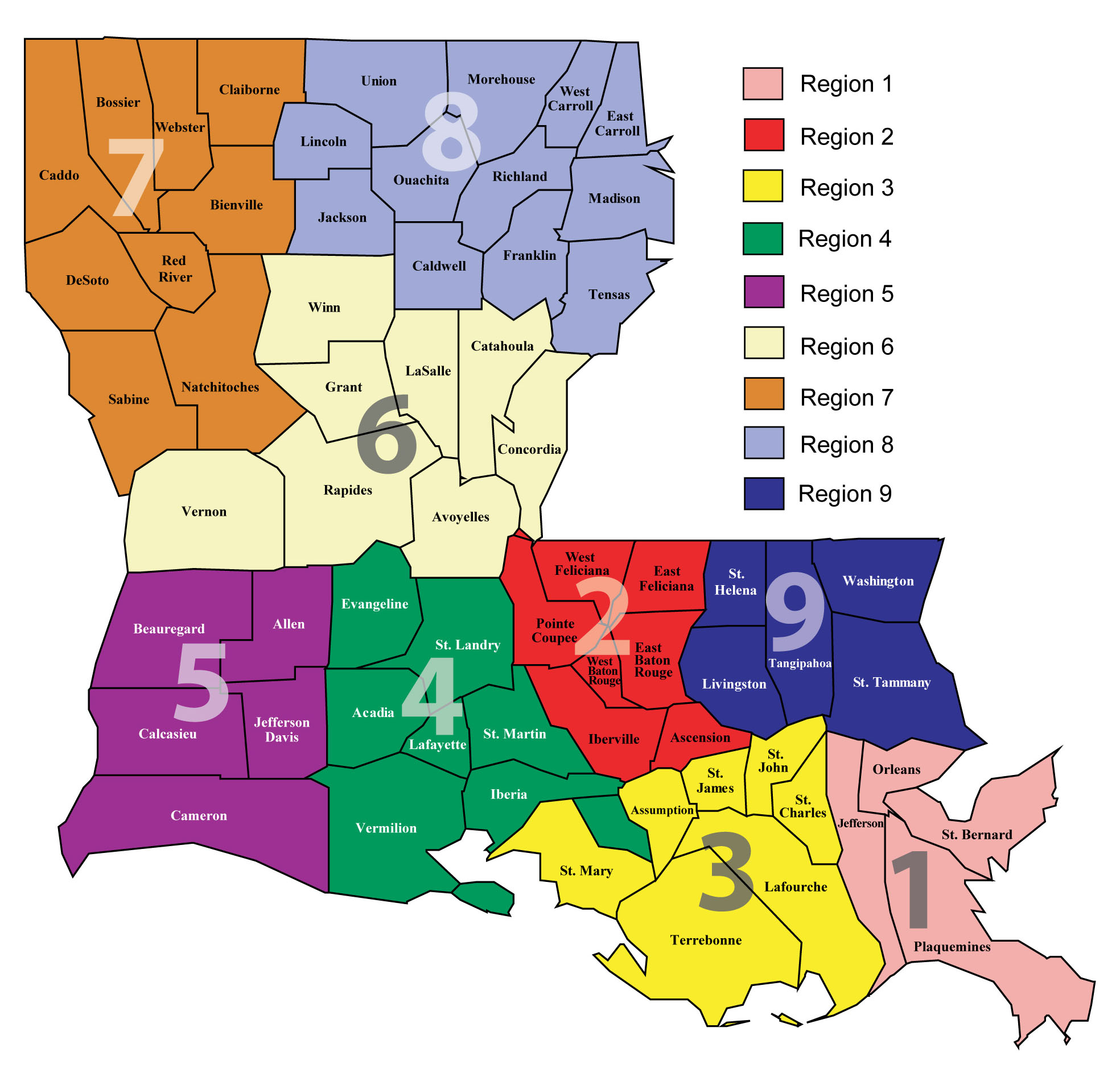
Be that as it may, does his explanation hold up? Edwards alleged that incidence and hopitalization in Regions 2 (based around Baton Rouge), 4 (based around Lafayette), and 8 (based around Monroe) had problematic increases, and Region 9 (the north shore) hadn’t declined. And how does the reconfiguration of testing data done last week affect such calculations?
As previously noted, testing numbers by parish weren’t adding up in the first month data were disseminated. Some parishes had more infections than tests, because tests weren’t matched to residences. Thus, in many cases people from lower-populated parishes had testing performed in higher-populated parishes. Nor did the sum of parish totals match the reported statewide total.
Finally, the state got it together and began matching test to residence, which produced some dramatic shifts in reported numbers. For example, Lafayette Parish declined from 17,155 to 8,234 and Ouachita from 6,647 to 4,688 while Iberville rose from 383 to 1,227 and West Baton Rouge from 53 to 466. Inexplicably, it also reported over 4,700 fewer tests than it had said occurred previously.
The impact of these changes could play into a narrative of unacceptable potentially increased infection rates. With a lower proportion of the population tested, it could make Lafayette and Monroe look like more fertile grounds for infection. Whether a desire to build a case for the crisis being greater than first thought in some places was a factor in the decision to reclassify is not public knowledge.
Let’s look at the leading indicator of virus incidence, cases reported. That’s one of two criteria Edwards alleged he used in declaring Regions 2, 4, 8, and 9 problematic, while absolving the first two hot spot regions 1 (around Orleans/Jefferson) and 7 (around Caddo/Bossier) as well as not citing other regions, including 5 (around Calcasieu) and 6 (around Rapides) along with 3. The other indicator is middling, hospitalizations, and has less data released to construct a timeline. The lagging indicator, deaths, was not considered.
Parish data used will be the ones mentioned above, plus others that have significantly large populations in their regions. For analysis purposes, Region 2 will also include Ascension, and Region 9 will be St. Tammany and Tangipahoa.
The Edwards Administration uses a 14-day moving average for comparison purposes, supposedly because that’s how long the virus can remain infectious from acquisition to manifestation, even as the median time is just five days. There’s no scientific reason to use that figure, which tends to overinflate the number of cases and underestimates the amount of change. Let’s use a more meaningful seven-day average, exclude Region 3, and put the others into three categories: the regions to blame for the statewide imposition (2,4,8,9) which according to Edwards should show a rising number of cases which also would reflect in a refusal of the average percentage increase to go down (except perhaps in 9); the original hot spots (1,7) which should show decreasing numbers of cases and proportional change; and the quiescent regions (5, 6) that haven’t shown the potential to get worse and thus follow the same pattern as the hot spots.
Those are the implications behind what Edwards said on Apr. 27. Looking at the data from Apr. 23 (five days’ worth) to that point, these don’t back him up at all:
Seven-day moving average of daily case increase
Blameworthy
2: 47.43 50.86 43.57 41.00 42.71 change -4.72 -10 percent
4: 7.43 6.29 4.00 3.43 2.86 change -4.47 -60 percent
8: 21.43 18.29 18.00 15.86 18.14 change -3.29 -15 percent
9: 35.14 34.71 33.86 33.86 28.29 change -6.85 -19 percent
Hot spots
1: 142.71 127.00 115.43 115.57 80.00 change -62.71 -44 percent
7: 38.57 30.71 31.86 32.00 33.57 change - 5.00 -13 percent
Quiescent
5: 11.29 10.43 12.29 12.29 11.86 change +0.57 + 5 percent
6: 4.00 4.57 5.43 5.29 5.57 change +1.57 +39 percent
Seven-day moving average of daily percentage case increase
Blameworthy
2: 2% 2% 2% 2% 2%
4: 2% 2% 1% 1% 1%
8: 4% 4% 3% 3% 3%
9: 2% 2% 2% 2% 2%
Hot spots
1: 1% 1% 1% 1% 1%
7: 2% 2% 3% 2% 2%
Quiescent
5: 2% 2% 2% 2% 2%
6: 2% 2% 3% 2% 2%
The regions that Edwards alleged still showed increasing new cases day-to-day in fact all had fewer cases according to their seven-day averages, with those averages declining anywhere from 10 to 60 percent over those five days. The hot spots, as would be expected after such a long period of activity, are in decline. But two of the areas Edwards asserted weren’t trouble because they weren’t showing increases in fact are headed higher, at 5 and 39 percent.
And, regardless of region, in all eight the curve has been flattened. On Apr. 27, the highest was a three percent change.
Now, let’s consider the argument whether too little testing of residents in some regions demanded a greater margin of error. As of Apr. 27, these were the proportions in the parishes representing the regions above (excluding St. Tammany, which I had aggregated elsewhere):
Blameworthy:
East Baton Rouge – 21.43%
Ascension – 20.36%
Lafayette – 5.38%
Ouachita – 14.12%
Tangipahoa – 19.95%
Hot spots:
Orleans – 30.07%
Jefferson – 30.32%
Caddo/Bossier – 10.44%
Quiescent:
Calcasieu – 7.86%
Rapides – 12.42%
Looking at these numbers, you simply can’t make the argument that the blameworthy parishes and the regions they comprise the bulk of residents present too much danger. Consider that the statewide average of tested residents that day was at 18.88 percent; three of the five parishes listed exceeded that. Both of the quiescent parishes were well under, yet Edwards deemed that an adequate amount to say they met the criteria of falling caseloads – when in fact their raw caseloads were increasing. Only in the case of Lafayette could you argue too little testing had occurred to be confident – yet that parish had the fastest falling raw number the moving average of which has fallen further since.
What Edwards proclaimed on Monday had nothing to do with the data then available on cases. No science backed his assertion that four rogue regions were spoiling the party and therefore the whole state had to suffer for another 15 days. That means, if not backed by science, his decision rested on politics.
No comments:
Post a Comment